Ressemble is a brand new platform that helps sales leaders get insight into the valuable DNA of their potential customers by enabling their sales team to work towards objectives while collecting information. I help them define their visual language and create seamless user experiences.
My role
- Lead design sprints and discussions
- Visual design
- HTML/SCSS implementation
Tech & tools
- Miro
- Figma
- Elixir
- HTML
- Tailwind CSS
Dates
- March 2021 - present
Call debriefs
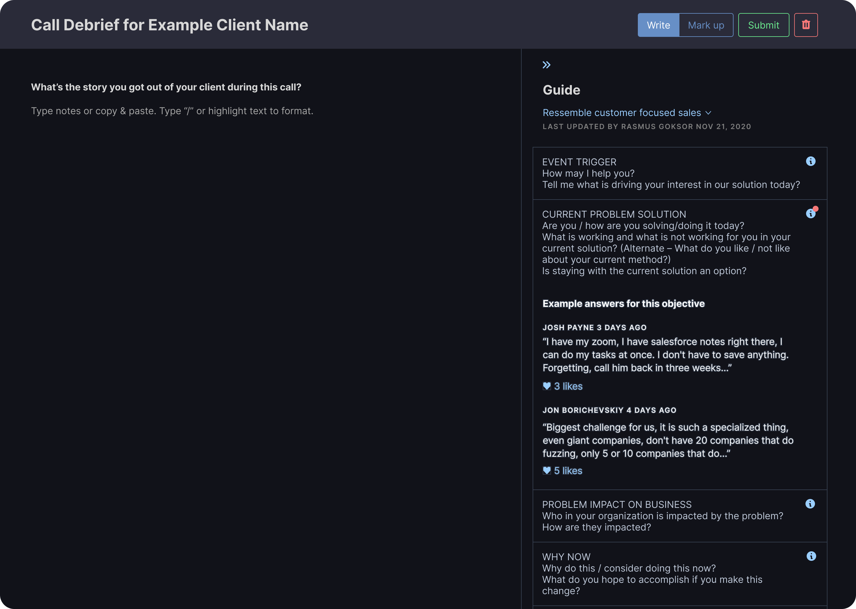
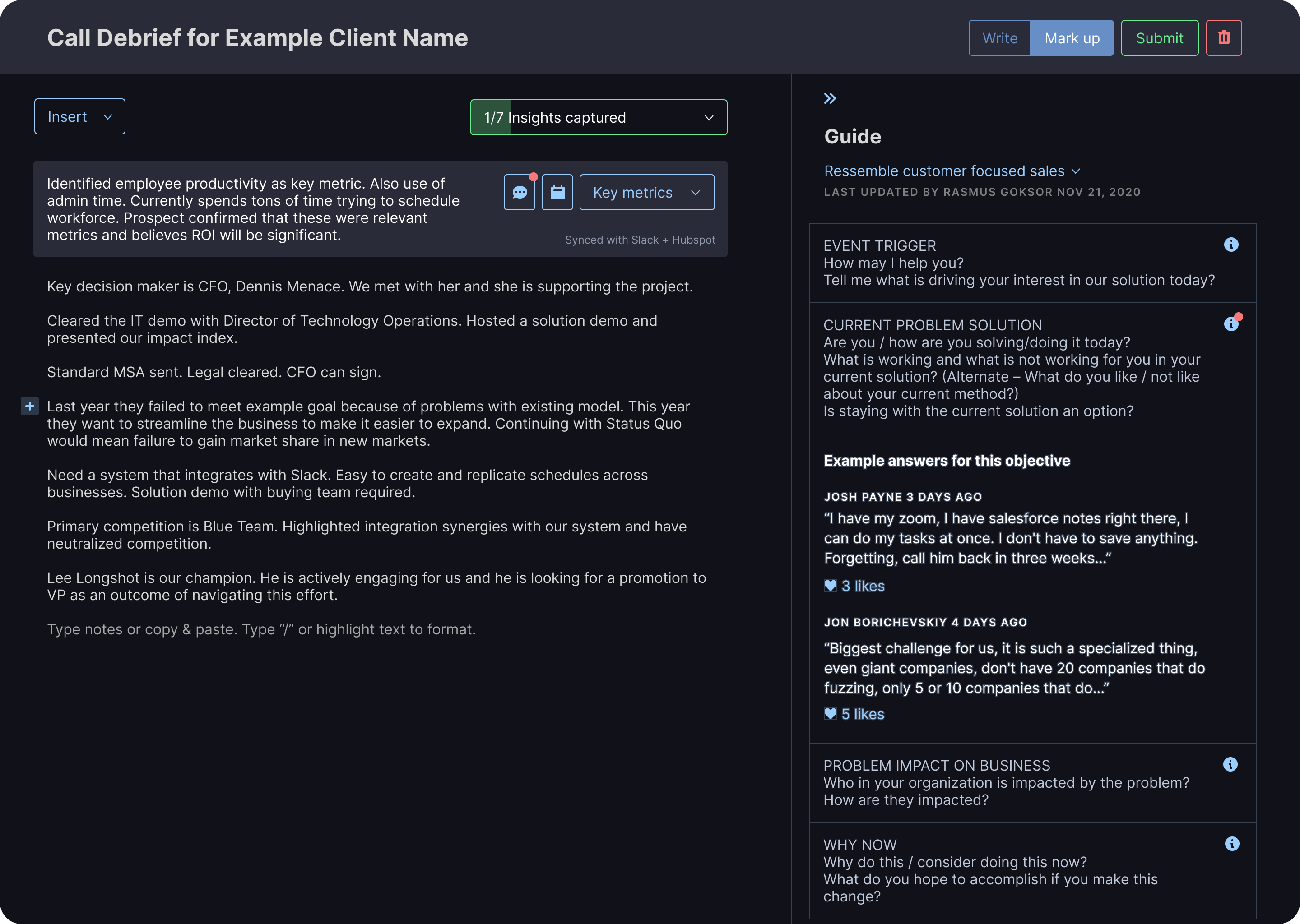
Making call notes actionable
By giving users quick access to key actions we are able to teach sales teams that the information they collect is useful beyond notes that refresh your memory. Here we surface comments from a user’s team and allow users to schedule reminders concerning a specific note.
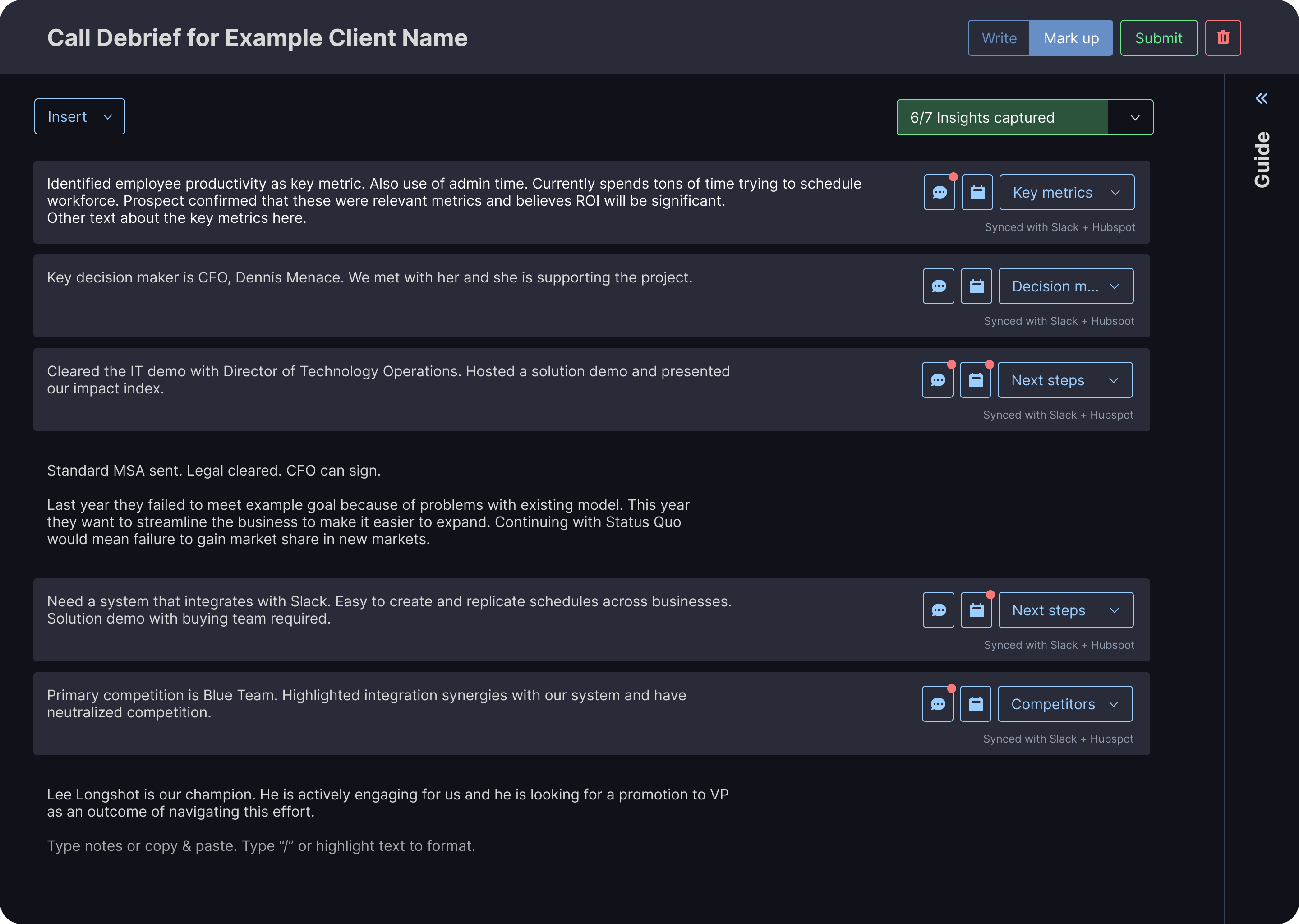
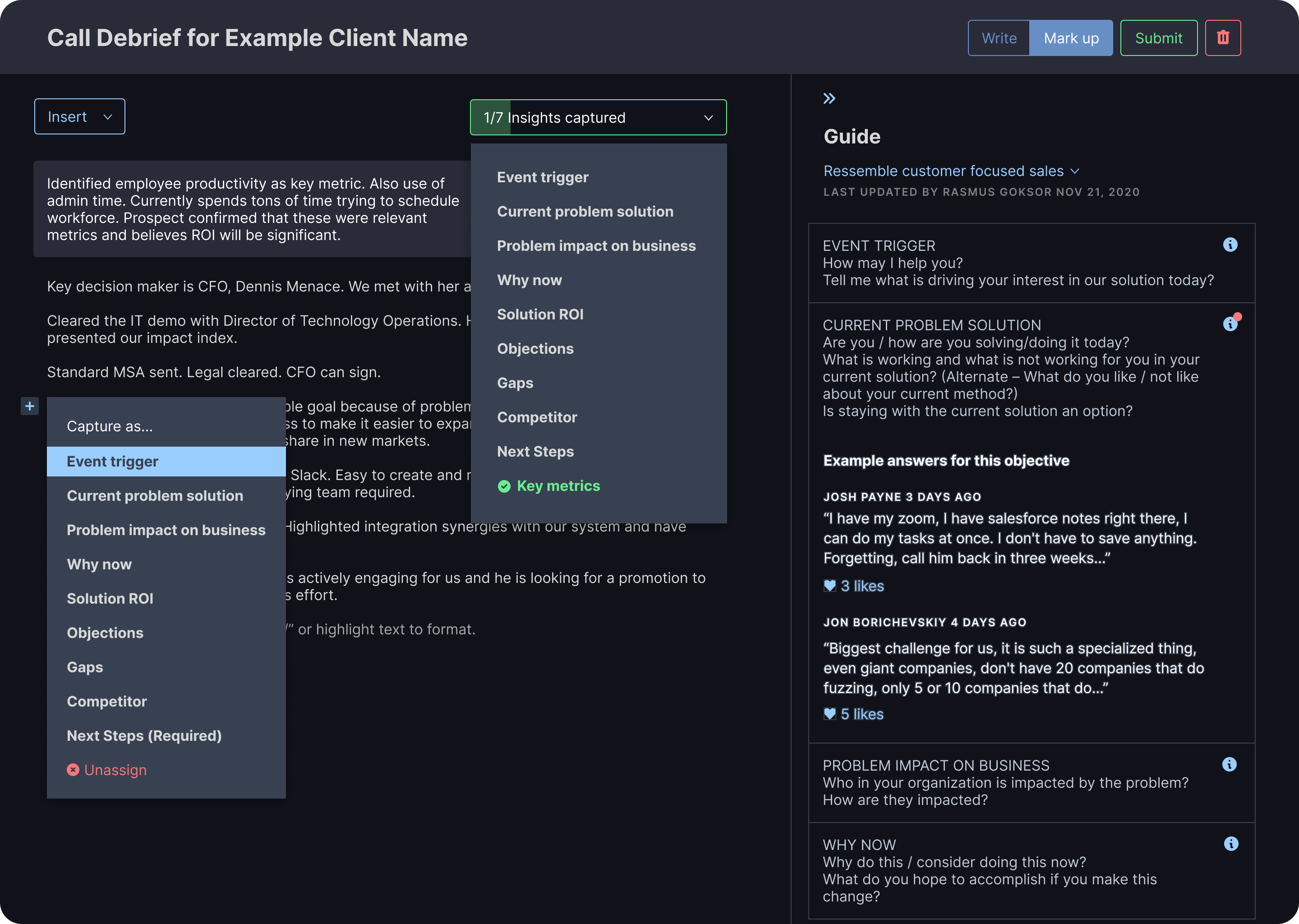
Multiple ways to mark up notes
Users are unique. Through our testing we found many different working styles and preferences by our users. We provide several entry points for marking up notes to minimize friction.
Showing progress, building motivation
Allowing users to see how many objectives they’ve captured as they go helps motivate them to collect the information necessary to finish it 100%. The guide provides more in-depth descriptions of the objectives themselves.
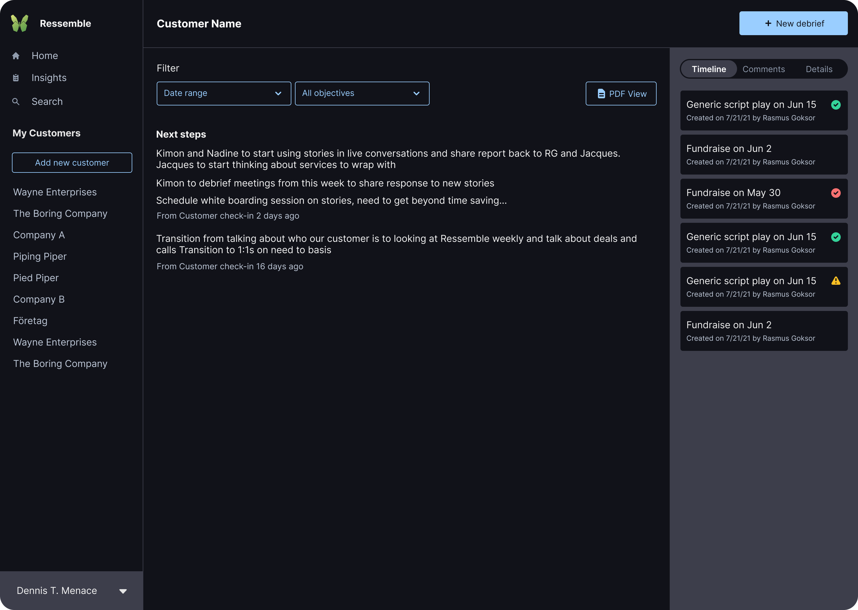
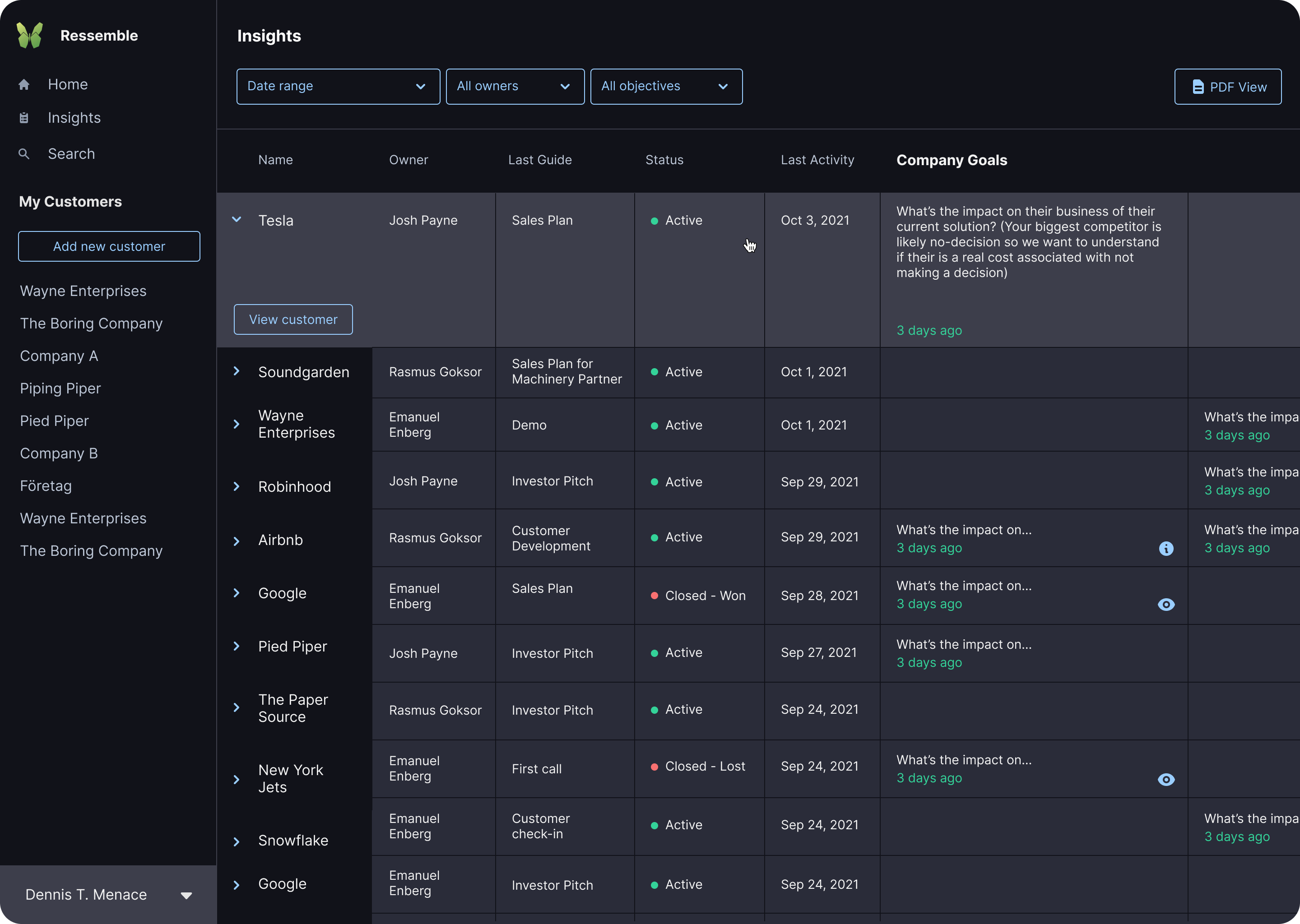
Customer summary
Focusing on the task at hand
The objectives and notes are at the forefront here, while the putting the timeline, comments, and details in a tab-able sidebar lets users focus on the task they came to accomplish.
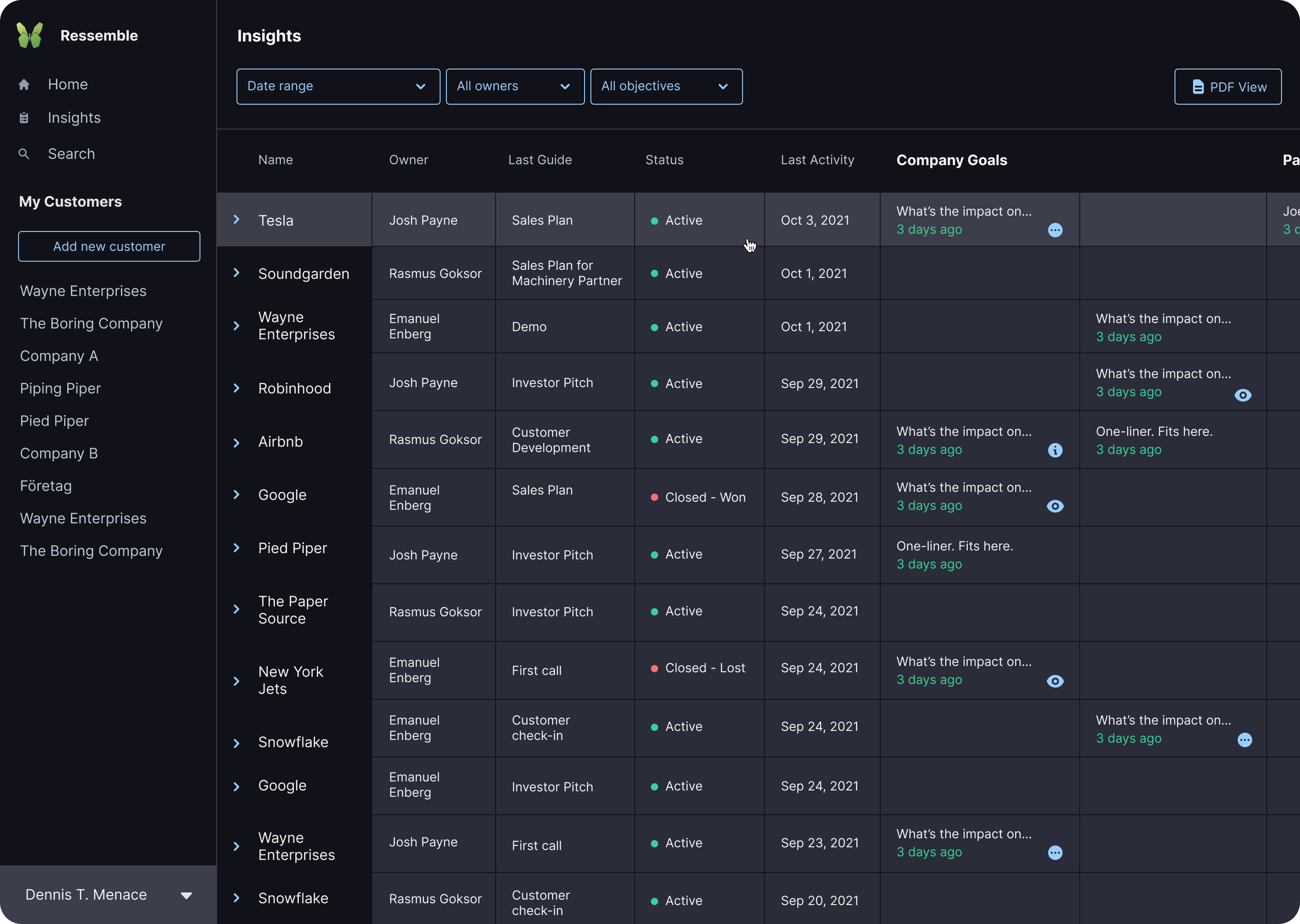
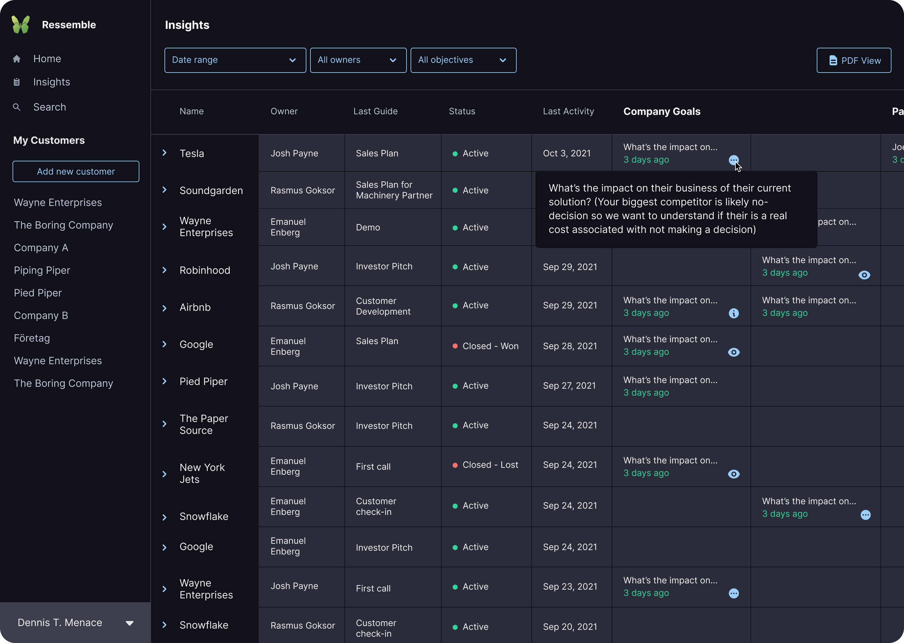
Insights report
Compact view, easily accessible details
The objectives and notes are at the forefront here, while the putting the timeline, comments, and details in a tab-able sidebar lets users focus on the task they came to accomplish.
The code
Repetitive, overly specific styles
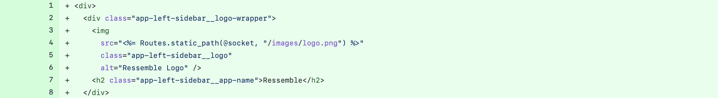
When implementing the designs shown above, one of my main focuses was to utilize Tailwind more to make the styles more DRY (Do not Repeat Yourself). By using the principles of BEM naming conventions I was able to condense the numerous and varying button styles into just two button styles that managed to work for almost all use cases across the app.
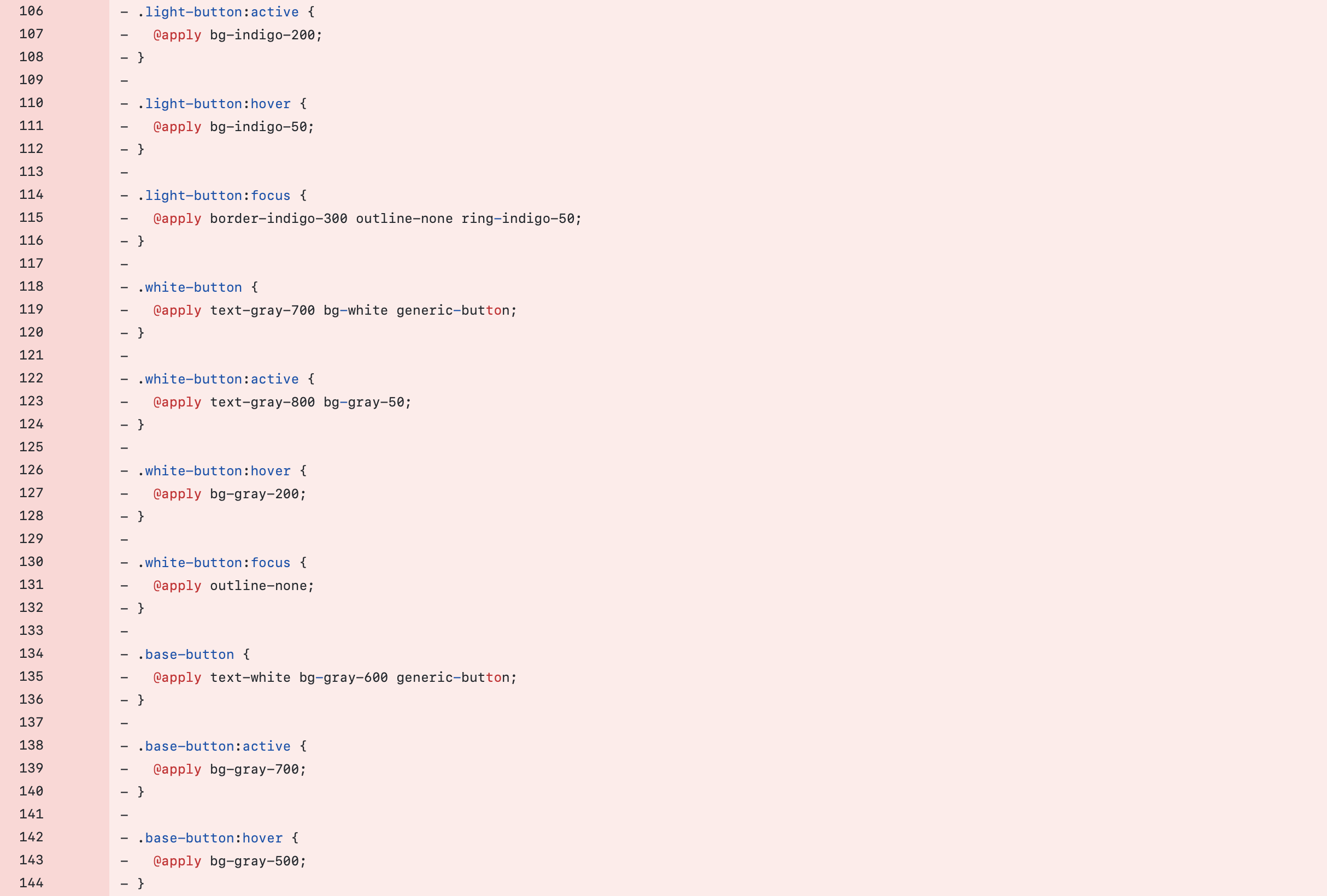
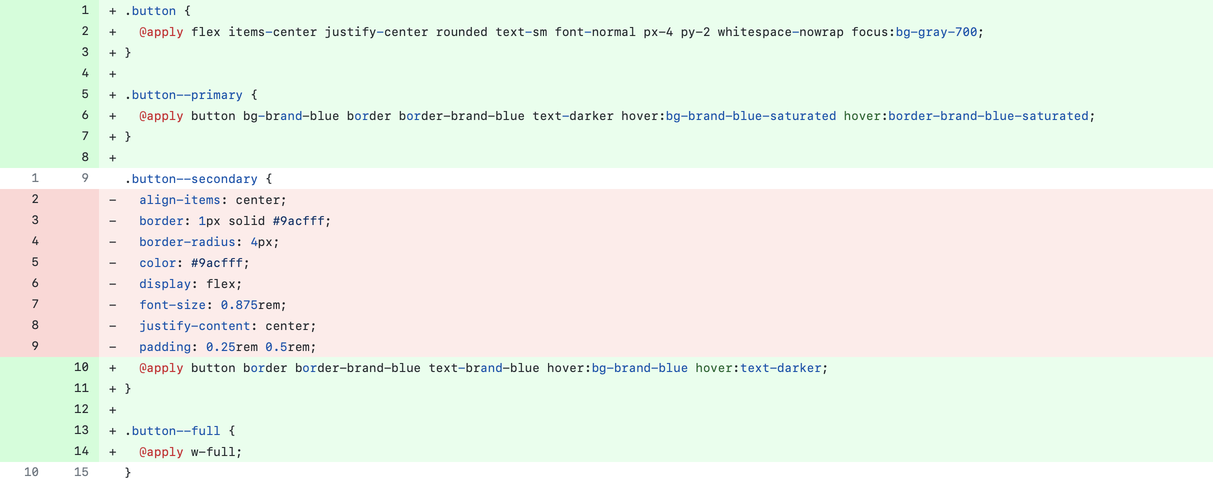
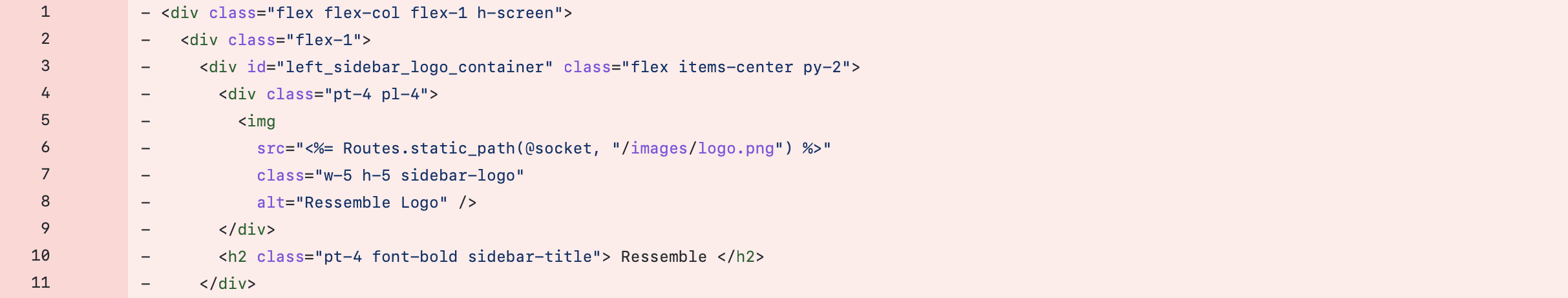
Opaque HTML and monolithic stylesheets
As a new developer to the project trying to rework the existing HTML, I found that the Tailwind styles were not descriptive enough to let me know what I was looking at in the code.
By reworking the CSS to use BEM naming conventions and creating classes for the styles that contained Tailwind classes we were able to have the best of both worlds. Once refactored, the class names inform other developers of what each element is while still using Tailwind in the stylesheets.